
Which CSS Framework is the G.O.A.T.?
If you’ve ever delved into web development at any level, you’ve probably reached a point where you gotta make things look nice. Maybe you’re a backend developer who needs to make your data look presentable or a frontend engineer who needs to figure out how the f*** you’re going to implement your designer’s designs. Obviously, you can make everything you want using just vanilla CSS but the reality is, that takes a lot of time and effort, especially if you’re new to CSS. Fortunately, there are hundreds (make that thousands) of tools that give us a layer of abstraction to build websites at hyperspeed.
This article will go over CSS tools that I’ve personally used (mostly in React / Next.js) including popular ones like Bootstrap, MUI, Chakra, and Tailwind. There’s a few different types of frameworks we’ll be going over as well - namely built-out component libraries, utility classes, and CSS-in-JS solutions.
Component Libraries
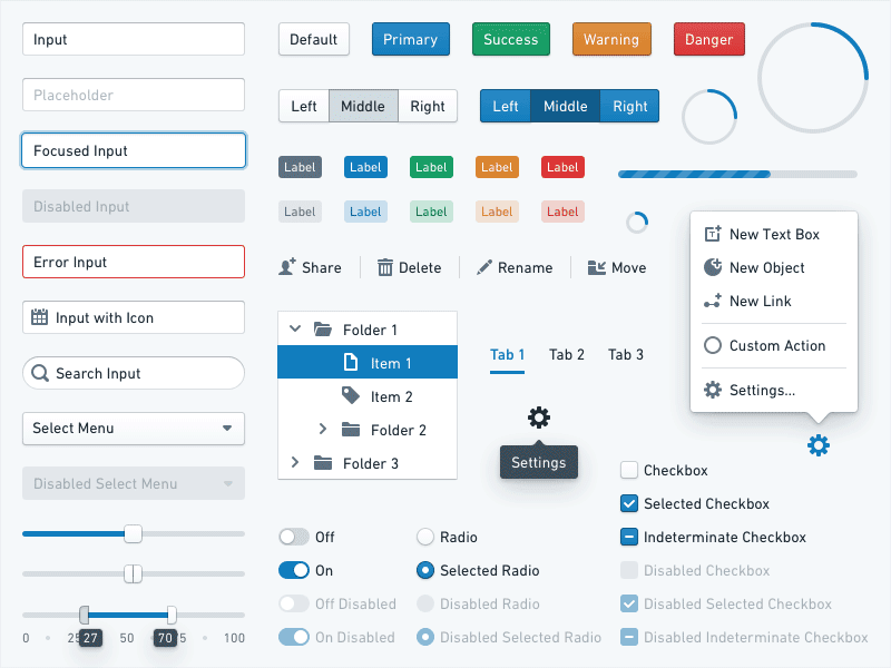
A component library is essentially just a bunch of frontend elements that can be reused throughout your application. This includes buttons, input fields, dropdowns, etc. Component libs give you loads of already-built designs, which takes the burden of design off of the developer. If you’re familiar with React you’re probably already familiar with what a component library is, since you’ll often find yourself creating your own!
When should you use a component library?
You should use a component library when you want to utilize an already-tested and familiar design language. That’s a fancy way of saying - when you don’t want to spend time designing stuff and just want to get your content out there. A lot of component libraries say that they are customizable and they are, to some extent. You can customize things like colors, fonts, and other basic elements and different libraries have different levels of customization. But unless a comp lib is completely headless (we’ll get into that later), they are a serious pain to fully customize to your needs. Trust me, I’ve tried customizing some of the more specific elements such as what a radio button looks like and it’s a tall order. So whatever you see is pretty much what you get.
Bootstrap
You’ve probably heard of Bootstrap before. It was released in 2011 by Twitter as an open-source project and has since become very popular. Bootstrap actually helped to standardize a lot of different elements since so many people used its components!
Pros:
- It’s got typography, forms, buttons, navigation elements, and other components like maps and fields. Literally any component you can think of, they got it.
- It’s responsive and the grid mechanic makes it a breeze to align and place content.
- Provides the highest speed of development due to everything being abstracted for you
- 12-column grid system that allows you to space things out responsively. Grid systems are a blessing for those who struggle aligning things using CSS.
You’re probably thinking - that all sounds great! I can stop reading since this is the 🐐 of CSS Frameworks right? Maybe, but let's go over some of the bad.
Cons:
- Bootstrap makes all the decisions for you design-wise. It’s overused and very recognizable.
- Very bloated if you’re not using webpack - even then you’re not going to be using all the elements since there are so many!
- React versions are also very bloated
- Mobile-friendly but not mobile-first
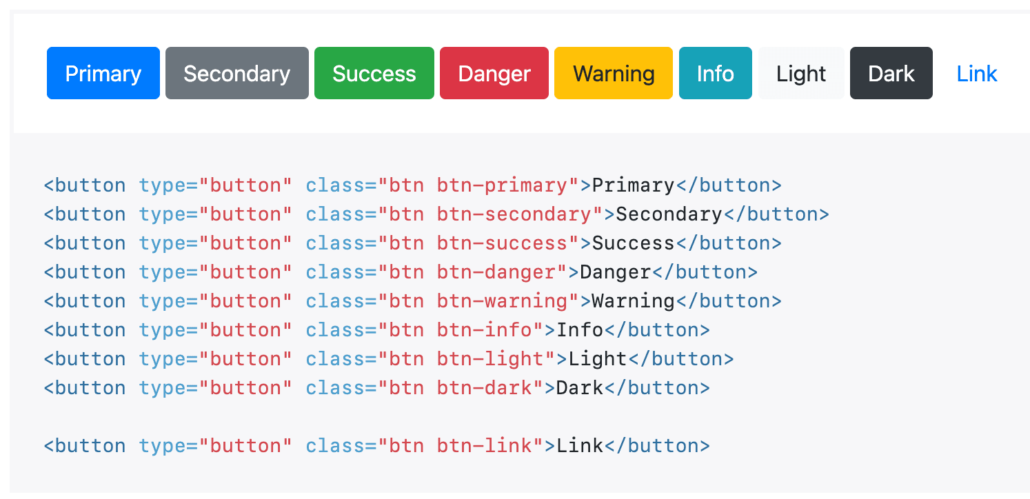
Here’s a simple example of Bootstrap button classes:
So what does this mean for you? Bootstrap is great if you don’t have any designs whatsoever and just need to quickly chef up a website. However, to be completely honest, I wouldn’t recommend using Bootstrap especially with React and would use it’s newer and currently more popular alternative, Material UI.
Material UI
Material UI (MUI) is like the new-and-improved, React-ized version of Bootstrap. It follows Google’s Material Design guidelines, so a lot of the elements may look like Google/Android. It’s also MUCH more customizable than Bootstrap.
Pros:
- Widely used even by massive tech companies so lots of support and not many bugs
- Easy to use and has amazing documentation
- Plethora of mobile-first components. They have one of the most built-out libraries of them all.
- Gorgeous design along with a built in dark-mode
- Built for React / Next
- Grid system (12 column) or a Grid v2 responsive
As you can probably tell, I’m a fan of MUI. Numerous companies use it, especially startups who need to get off the ground running. MUI allows you to customize a lot more parts of it’s components as well so if you want to use a different design system than Google, you totally can.
Here’s all the code you need to implement this date picker:

<MobileDatePicker
  label="Date mobile"
  inputFormat="MM/DD/YYYY"
  value={value}
  onChange={handleChange}
  renderInput={(params) => <TextField {...params} />}
/>
That’s it. Just 7 lines of code! There are a few things MUI can do better, though.
Cons:
- Possible breaking changes every iteration. As with a lot of software, you may need to change up your code if you want to upgrade to a new version.
- It is possibly to style out of Material Design with your own design system, but it’s definitely not easy or trivial to do so. Definitely not beginner-friendly.
- Performance issues and insanely high bundle size
- If you are more of a veteran frontend developer, the internal code is much more convoluted if you need to debug.
If you’re a backend developer who still want’s a great looking frontend with minimal effort, this is the tool for you.
Chakra UI
A great alternative to MUI is Chakra UI. It’s a much newer alternative released in 2020 built by the absurdly talented Segun Adebayo. My favorite part of Chakra is that it’s built using Typescript and React hooks so it pairs extremely well with Next w/ TS!
Pros:
- Very customizable. It’s much more customizable than MUI and it makes it more easy to not only change the styles but also the behavior of elements using React hooks.
- Great accessibility tools out of the box
- Able to build your components using the components as building blocks
- Dark Mode switching made easy
- Not too bloated
- CSS Styles as props. This is a semantic difference but can be great if you like using React props.
Cons:
- Still not able to style some components such as checkboxes.
- Missing a few core components such as tables and date pickers
- On the newer sides so could have bugs
- The responsive design system is great but the syntax can become cumbersome if you have too many breakpoints
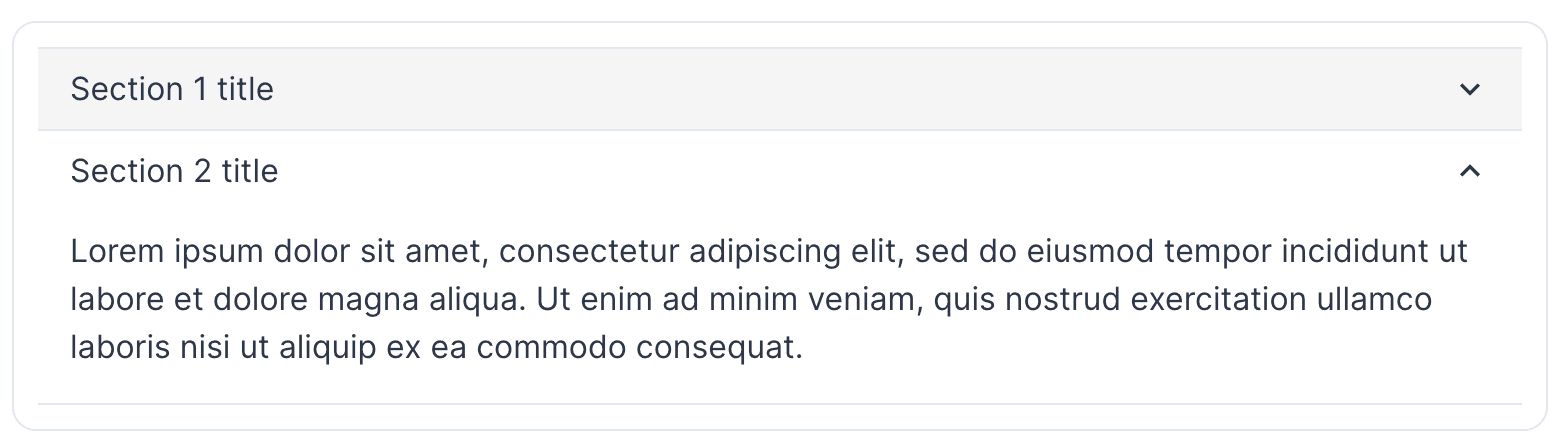
Here’s the code for the following Accordian element:
<Accordion allowToggle>
  ...
  <AccordionItem>
    <h2>
      <AccordionButton _expanded={{ color: 'black' }}>
        <Box flex="1" textAlign="left">
          Section 2 title
        </Box>
        <AccordionIcon />
      </AccordionButton>
    </h2>
    <AccordionPanel pb={4}>
      Lorem ipsum dolor sit amet, consectetur adipiscing elit, sed do eiusmod
      tempor incididunt ut labore et dolore magna aliqua. Ut enim ad minim
      veniam, quis nostrud exercitation ullamco laboris nisi ut aliquip ex ea
      commodo consequat.
    </AccordionPanel>
  </AccordionItem>
</Accordion>
As you can see, instead of classes, Chakra UI opts for props.
I would use Chakra UI if you want a customizable, lightweight, and accessible component library and don’t need more niche components or want the ability to build our your own.
Mantine
Another even newer alternative to Chakra UI is Mantine, released in early 2021. I’ve personally only used Mantine a little bit but it’s more similar to Chakra UI than any other component lib so I’d say the pros and cons are pretty similar. Mantine has the best documentation with an in-line, playground type tool that lets you change what the element looks like and then lets you copy paste that code out. It also has a few more components that are missing in Chakra UI such as a fully-built text editor and date-picker.
Notable Mention Component Libraries
Some other ones I’ve only used a little but you can check out are bulma, Ant Design, Blueprint, React Suite, and Grommet.
Headless Component Libraries
What if you want the functionality of a component library but need to implement your own, completely unique design system? That’s what headless component libraries are for! They include un-opinionated website essentials such as dropdowns, cards, progress bars, toolbars, and so much more in the form of React components! My personal favorite is Radix that gives you a handful of elements with 0 opinions about your styling - you can make it looks like whatever your want! A few other notable options are headlessUI, ReachUI, Reakit, and AriaKit. If you’re using Tailwind (see below), I strongly suggest using headlessUI since they are references in the TW docs and are made by the same creators.
Utility Classes
Now what if you want to style your components, either created by yourself or the headless components above, without using vanilla CSS? That’s where utility classes shine. Utility classes are basically the same as css but written in a way to allow for extreme speed of development. Because of this, though, you must have a very strong understanding of CSS before you can effectively use ‘em! They are a frontend developers best friend. 😄 Let’s look at an example:
.flex {
  display: flex;
}
.pt-3 {
	padding-top: 3px;
}
<ComponentHere className="flex pt-3" />
As you can see, utility classes are completely nomenclature-based. It’s like a shorthand version of CSS. The beauty starts when you start putting the classes together.
Tailwind
Tailwind CSS is by far the best utility class. Released in 2017, it changed the frontend game!
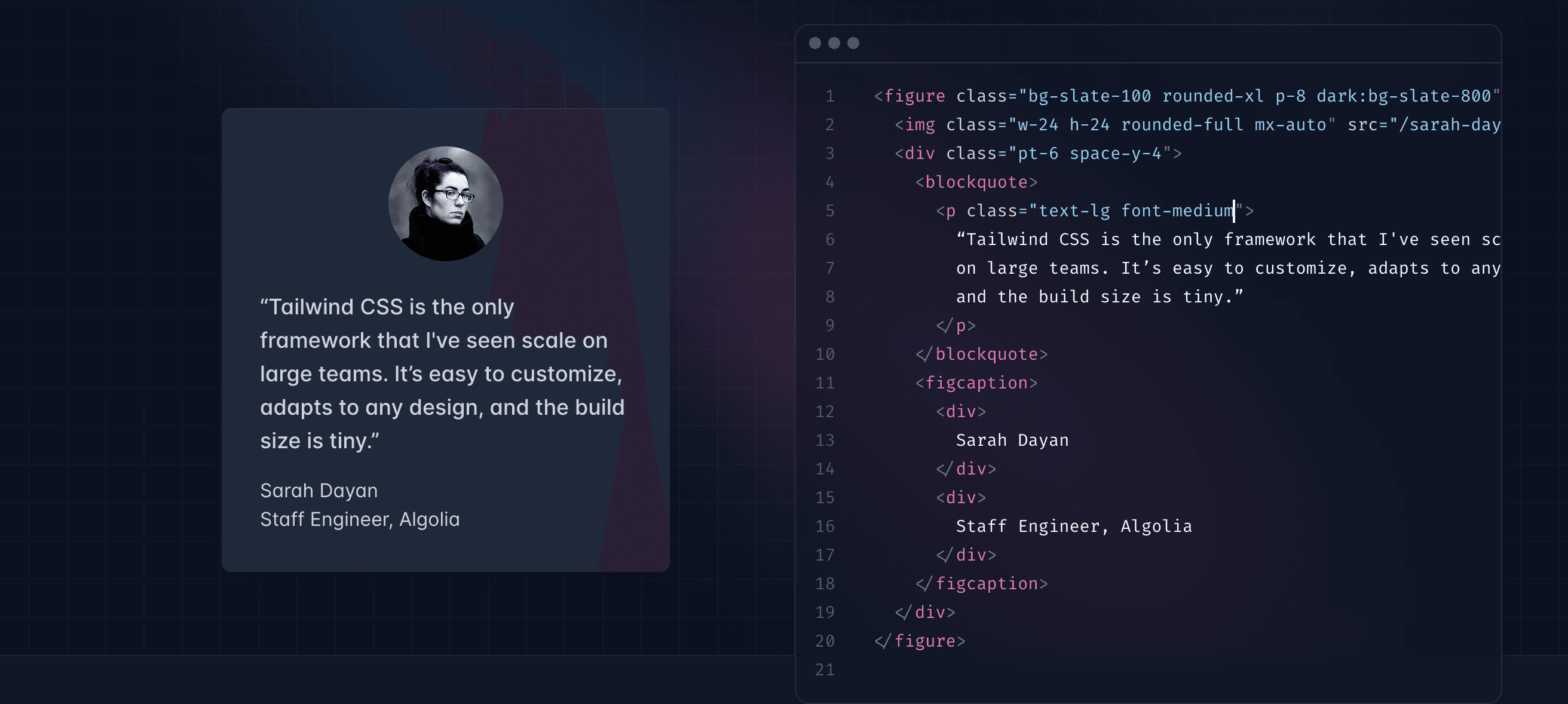
The screenshot above shows an example of a simple card in vanilla HTML. Tailwind
can be used in the exact same way in React / JSX, making it very powerful. You might
be thinking, this looks exactly like Bootstrap vanilla! The difference here is that
all the classes are just abstraction of CSS so there’s no built in btn class for
a button - you have to build your own!
Pros:
- Allows you to style at an extremely fast rate
- Completely un-opinionated since it’s a cleaner way of writing in-line CSS
- Purges unneeded css, allowing for smaller bundle sizes and faster speed
- No context switching from React files or HTML to your CSS file
- Very easy to add hover actions, dark mode, active, and form state styling
- Although it’s CSS, still enforces a design system with its initial theming
Cons:
- Verbose HTML could irk some developers (but trust me you’ll get used to it)
- High learning curve - you have to know CSS and learn Tailwind syntax and classes.
- Components aren’t included by default. You need to buy Tailwind UI separately and install headlessUI (both extremely worth it in my opinion).
Tailwind is what I use all the time for any of my projects. It’s extremely powerful for those who are familiar with CSS and those who want to start learning as well!
The creators of Tailwind have also created their own UI library, TailwindUI, and headless framework, headlessUI, that all function perfectly together. The reason this is so much better than the libraries above is because you can rapidly iterate over the provided designs using simple Tailwind classes, without the headache of trying to style or theme your entire framework! Another amazing part of TailwindUI in particular is you never need to npm install anything - you just copy and paste the source, allowing you to quickly iterate while also making your project lightweight AF.
Here’s an example of a fully functioning Navbar using Tailwind CSS & UI:

<div>
  <div className="sm:hidden">
    <label htmlFor="tabs" className="sr-only">
      Select a tab
    </label>
    <select
      id="tabs"
      name="tabs"
      className="block w-full rounded-md border-gray-300 focus:border-indigo-500 focus:ring-indigo-500"
      defaultValue={tabs.find((tab) => tab.current).name}
    >
      {tabs.map((tab) => (
        <option key={tab.name}>{tab.name}</option>
      ))}
    </select>
  </div>
  <div className="hidden sm:block">
    <nav className="flex space-x-4" aria-label="Tabs">
      {tabs.map((tab) => (
        <a
          key={tab.name}
          href={tab.href}
          className={classNames(
            tab.current
              ? 'bg-indigo-100 text-indigo-700'
              : 'text-gray-500 hover:text-gray-700',
            'rounded-md px-3 py-2 text-sm font-medium'
          )}
          aria-current={tab.current ? 'page' : undefined}
        >
          {tab.name}
        </a>
      ))}
    </nav>
  </div>
</div>
Parsing through this code might be a little daunting due to the sheer amount of classes but those are what give us so much power! We can add or remove classes to our liking till the component looks exactly the way we want it. In our Tailwind styles, we might have a different Hex value for indigo so that will automatically be applied when pasting-in the above code. 🤯
Fun fact: this is what the website you’re currently reading this is built on!
Notable Mention Utility Classes
A few other utility classes I’ve heard of are Tachyons and Basscss. Never used ‘em but linked so you can check it out.
CSS-in-JS
The last topic that’s out of scope for this article but I’ll touch up briefly as it’s extremely widely-used is CSS-in-JS solutions. CSS in JS is exactly what it sounds like - CSS inside of javascript! Many companies that create their own UI libraries or need the full power, 0-abstraction of CSS often utilize libraries like styled-components, Styled JSX, Emotion, Goober, JSS, blah, blah (there are so many others). These solution often utilize props, classes, JS, and React principles in one way or another and lets anyone write CSS in the same file as their React component or any other JS file.
Final Thoughts
If you made it this far, respect. That was a long read. You still might be wondering “Bik, who’s the GOAT? Is it Tailwind? MUI?”. It probably sounds like Tailwind, huh. And I know you’ll hate this answer, but the only correct answer is - it’s up to you. Just like the endless debates over the GOAT of basketball: Lebron, Jordan, Kareem, Kobe, the discussion of the best CSS framework will never truly end and a new player will enter the conversation every couple of years. I will say, though, do consider the pros and cons before you lock yourself into a framework since it could be hard to switch out. Thanks for reading and I hope this helped you in your journey to pick a CSS tool!